
Kindergarten Website Redesign
2022
UX Designer
Figma
Photoshop
WordPress
Work project
Kindergarten Website Redesign
UX Designer
Figma
Photoshop
WordPress
Work project
2022
🎯 Challenge
In 2010 the kindergarten Maternal Cucli launched its first website, in early 2021 the website still was a digital brochure lacking business and experience objectives.
🌐 Solution
A new responsive website oriented to foster meaningful interactions between potential clients and kindergarten members through delightful user experience.
Project Process
🟣 Research
🟡 Design
🟢 Evaluate
✌️Success Metrics
Greater impressions and clicks on Google Search and enhanced mobile usability.

Lead generation through on-site marketing tools: +52%. Implementation of marketing tools for the first time:
🗓 Book a visit online
📘Online Pre-registration
📑Inquiry Form
Empathize
🔵 Empathize
Maternal Cucli is a kindergarten established in Ibagué-Colombia in 1994. They offer care and education services to young children from 3 months to 6 years.
Previous website analysis
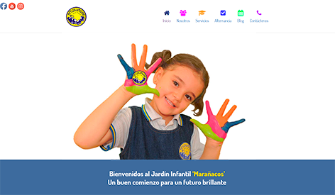
Previous website home
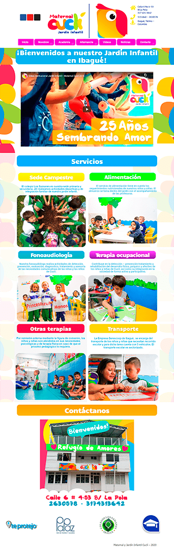
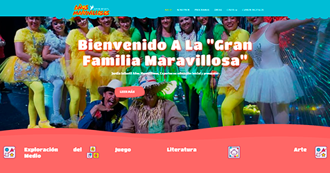
Previous website inner page

Previous website inner page

The challenge
After gaining understanding about the context and current problems, I defined a set of goals to work on the website redesign according to the stakeholders needs and interests.
- To enhance the user experience in the entire website.
- To implement marketing tools for lead generation.
- To apply the brand identity throughout the website.
Research
🟣 Research
2. Usability and conversion analysis
Google analytics metrics
With the approval of the kindergarten manager, I carried out an analysis of the Google Analytics metrics for November to December of the year 2020.
Specifically, I wanted to identify the most visited pages and the most and least relevant content for users.
November 2020
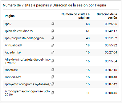
Pages with a bounce rate under 65%:
Academic (63%)
Homeschooling (42%)
About (60%)
Top 3 most visited pages:
PEI (68 visits)
Study plan (61 visits)
Pedagogical proposal (43 visits)
December 2020
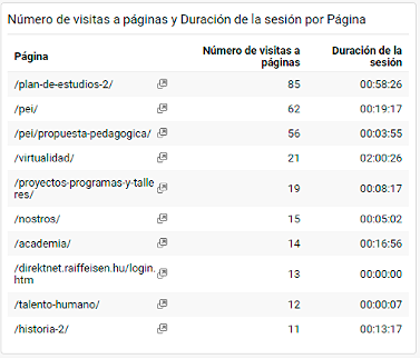
Pages with a bounce rate under 65%:
Study plan (63%)
Academic (63%)
History (50%)
Top 3 most visited pages:
Study Plan (85 visits)
PEI (62 visits)
Pedagogical proposal (56 visits)
💬Relevant findings
According to the following data, potential customers are highly interested in pages that convey academic information.
Usability and conversion analysis
I examined the previous website’s conversion and usability to identify challenges and opportunities for improvement.
Analyzed factors:
🔎Home page layout
🔎Most requested information
Additionally, I performed a heuristic evaluation of the site.
Home page analysis – above the fold elements

- Kindergarten logo
- Three social media buttons
- Contact information
- Main menu
- Institutional video
💬Relevant findings
There was no “call to action” elements on the homepage nor any other page. Some broken links on the header.
Analysis of the most requested information vía Facebook
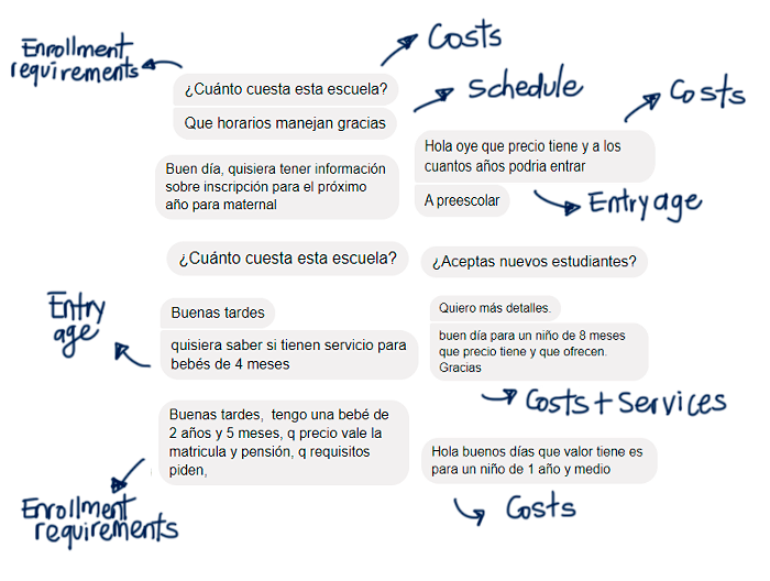
With the approval of the kindergarten manager, I had access to the kindergarten fan page on Facebook and the direct messages that potential clients sent requesting information.
💬Relevant findings
Some of the most requested information was not available on the website, for example, schedule, enrollment requirements, and educational costs.
Some of the most requested information was difficult to access or incomplete: services, ages, and levels.
Heuristic evaluation
For the usability analysis, I conducted a heuristic evaluation of the previous website, for this aim I used a comprehensive checklist from an academic paper.
Thanks to the evaluation, some improvement opportunities regarding the following heuristics were identified:
Visibility of system status
- Some links were missing or broken.
- There were no defined actions to perform within the website.
Match between system and the real world
- According to the analysis of the most requested information via facebook, it didn´t appear in a logical order for the users.
Consistency and standards
- The information was not displayed consistently on every page.
Aesthetic and minimalist design
- The writing style was heavy to readers and was not quick to interpret. In addition, the site lacked a visual system to ensure coherence and harmony across screens.
Help and documentation
- There was not a section of frequently asked questions (FAQ) available.
Content audit
Previous website Information Architecture
To get a complete picture of the Information Architecture of the previous site, I organized a Sitemap and inspected each page.

💬Relevant findings
Outdated relevant information, missing content, low readability, and need to implement calls to action according to business objectives.
Learning about best practices
To understand the competitors’ offer, good practices, and weaknesses, I made an inventory of the content and functionality of their websites.

💬Relevant findings
None of the three main competitors had set clear objectives or established clear actions to help users perform specific tasks on their websites.
Therefore, considering the users and commercial interests in the new kindergarten’s website could represent a competitive advantage.
Good practices identified from competitors: implementation of a WhatsApp button to offer a closer customer service.
Research insights
After the context analysis and user research, I got the following insights.
01
Users are highly interested in pages that convey academic information.
02
Users want to know soon about enrollment requirements and educational costs.
03
The visual design of the website is perceived as inconsistent by users.
04
Outdated information in the website can prevent potential clients to ask for further information.
05
Frequently, grandparents search for kindergarten information on the internet, therefore is critical to enhance content readability.
Design
🟡 Design
From research insights to design requirements
To inform the design phase, I prepared a checklist according to the research insights.

Listening to users’ perspectives
I conducted an Open Card Sorting with two current clients of the kindergarten to understand their expectations regarding content organization. I had built an initial Sitemap before the session and wanted to understand the user’s point of view without showing them this initial model.
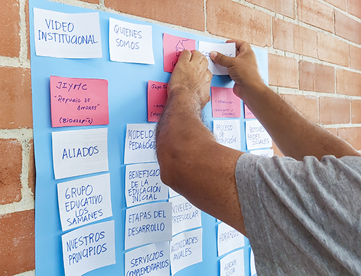

💬Relevant findings
I found that, I haven’t considered organizing all the prospective students’ and enrollment information in a dedicated section, which seemed to be logical to users. Additionally, FAQ section was requested to has an space in the home page.
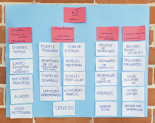
Card sorting outcome
As a result of the card sorting, I prepared a new website Sitemap considering the users expectations.
*Dotted boxes are new interaction points within the website.

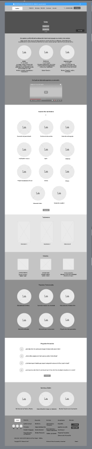
Wireframing
When the Sitemap was approved, I prepared the new website wireframes in Figma. At this stage, I worked together with the kindergarten academic coordinator to gather all the necessary written content that was included in the wireframes.
📐Outcome
Overall Wireframe

Home Wireframe
Feedback on wireframes
In a meeting with the kindergarten manager, I received feedback on the website wireframes that I had previously prepared.
Some of the main recommendations were:
- Make some adjustments on the home section hierarchy layout.
- Add a Google map next to the CTA button “Book a visit”on the home section.
- Avoid asking for children’s data in marketing forms due to Data Law regulations.
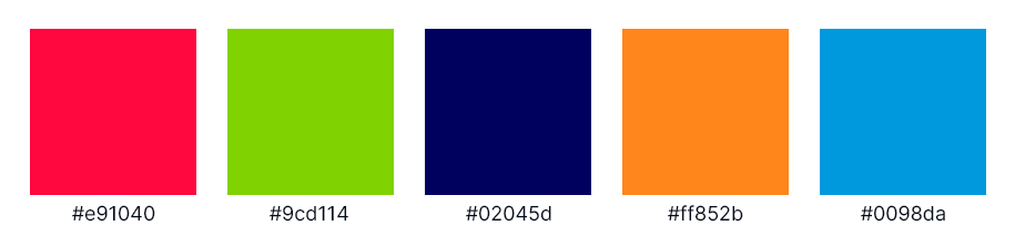
Visual Identity and Design Kit
After receiving feedback on the wireframes, I created the design kit for the website according to the brand guidelines of the Kindergarten, which included specific colors and typefaces.
Fonts
Big Title H1
Poppins, 56px, 600w
Small Title H2
Poppins, 36px, 600w
Body Text
Poppins, 24px, 400w
Button Text Link
Poppins, 18px, 500w
Images

Border radius 30px
Buttons
![]()
Text buttton

Outlined button

Contained button
Colors
Evaluate
🟢 Evaluate
After a comprehensive design process, I delivered the redesigned website –> Access the live site here.
Next steps to evaluate the website
After delivering the website to the client I suggested some next steps oriented to continuous improvement of the website.
- Conduct usability testing with two types of users: current and potential customers of the kindergarten.
- Conduct a website survey to get UX insights on user frustration and task failures and investigate what type of content users prefer.
- Additionally, include more valuable content and tasks for current kindergarten customers. For example, a “Resources” section to offer curated lists of tools and content for parents. As well as setting an online payment button to make payments for educational services.
Main lessons learned
- The importance of simplicity.
- Learning to make design accessible is an ongoing and highly relevant process.
- It is important to understand the context and background of existing products.