
Vision App
Designkonzept für eine Augenklinik
MEINE ROLLE
UX-Designer
UX-Researcher
UI-Designer
TOOLS
Figma
Zoom
Miro
HERAUSFORDERUNG
Augenpatienten fühlen sich vor und nach medizinischen Eingriffen oft ängstlich und unsicher, da sie sich Sorgen um ihre Sehkraft oder die potenziellen Risiken der Operation machen. Daher rufen sie wiederholt in der Klinik an oder suchen diese auf, um Informationen über Pflegepraktiken und die Dokumentation zu erhalten.
Diese wiederholten Anrufe und Besuche können die Klinikmitarbeiter stark belasten und führt sowohl bei den Patienten als auch beim Pflegepersonal zu Frustration.
PROJEKT-ZIEL
Ziel des Projektes war die Entwicklung eines Designkonzeptes zur Verbesserung der Kundenzufriedenheit von Augenpatienten und der Arbeitsbelastung des Pflegepersonals durch Hilfe zur Selbsthilfe bei der medizinischen Behandlung, Vereinfachung der Verwaltung medizinischer Aufzeichnungen, Erlernen relevanter Selbstpflegepraktiken und Aufrechterhaltung des Überblicks über die wichtigsten Anforderungen.
MEINE AUFGABEN
- Untersuchung des Problemkontextes durch Analyse von Qualitätsindikatoren im Kundenservice, Durchführung von Experteninterviews, Nutzerbefragungen und Wettbewerbsaudits.
- Erstellung von Personas und einer User Journey Map auf Basis der Forschungsergebnisse.
- Erstellung von Information Architecture, Wireframes und High- Fidelity Prototypen.
- Konzeption, Durchführung und Auswertung von Usability-Tests.
Understanding the user
Problem discovery
For the project development I decided to focus on a specific area: a hospital that exclusively attends ophthalmological patients. I managed to establish contact with one of the hospital managers who provided me with information, under strict care, to work on the project.
Afterwards, I proceeded to deconstruct the problem space it into subproblems, which I tackled by establishing a research goal.
1. The who, what, where, when and why of customer service in an Eye Hospital.
2. What does it mean to provide an outstanding customer service in healthcare?
3. What are the specific requirements of customer service in healthcare in a small town in Latam?
To understand the problem area, I gathered information about the Eye Hospital’s health services and customer service.
Eye Hospital’s Customer Service areas and channels:
AREA
General user service
Private user service
Appointment center
Surgical user service
CHANNEL
📧☎️📲🌐🗣
☎️📲🌐🗣
📧☎️📲🌐
📧📲🗣
AGENTS
(1)
(1)
(2)
(1)
Research goal
After getting a sense of the problem space and the health offer of the Eye Hospital, I was able to formulate a goal to frame the research work.
🎯 Understand the eye patients’ experience, their needs, and frustrations in relation to the customer service provided at the Eye Hospital.
Research methods
To address the research objective and subproblem questions, I applied a mix of research methods focused on understanding the patients’ experience and their perception of customer service.
METHOD
Expert interview
Desk research
Satisfaction report review
Analysis of PQR survey
User interviews
Competitive audit
User testing
PHASE
Discovery research
Discovery research
Discovery research
Discovery research
Discovery research
Design research
Design research
SUM
(1)
–
(1)
(4)
(5)
(4)
(5)
Pain points
By learning about patients’ needs, behaviors, likes, and dislikes, I prioritized certain needs for future design work. Out of a total of eleven (11) pain points, the following were prioritized. This prioritization was based on the outcomes of the eye hospital satisfaction survey accomplish by the hospital quality team in the months of June, July, and August 2021. (total of survey respondents 640)
📅
High difficulty scheduling an appointment over the phone.
📋
Lack of clarity with the preparation instructions for surgeries.
⏳
Dissatisfaction due to long waiting times before receiving medical care.
💬
Misinformation and confusion in the delivery of results.
User Journey Map
After conducting the interview with experts, the analysis of the annual satisfaction report, the analysis of requests and complaints, and the interviews with users, I defined 4 pain points, and finally proceeded to create the user journey map to identify new pain points and opportunities for improvement.
I developed this process by analyzing every action the user takes on their vision health journey. The case I studied specifically, was that of a user who arrives at the eye hospital to request an ophthalmology appointment and is subsequently referred for outpatient cataract extraction surgery.

Problem statement
To build the problem statement that describes the user needs that should be addressed, I used the 5 Ws framework. This model helped me focus on describing the context of the problem from the user’s perspective.
–> Who is experiencing the problem?
–> What are the pain points you are trying to solve?
–> Where is the user when they’re using the product?
–> Why is the problem important?
–> When does the problem occur?
José is a retired salesman who needs an easy app experience to organize their medical documentation and control the medical instructions and recommendations because he is often confused and frustrated with the increasing amount of medical information he must manage through their medical journey.
Starting the design phase
Ideation
Going from the research phase to the design phase, I started with the ideation process. After empathizing with the users and defining the problem statement, I started brainstorming potential solutions.
Finally, three of the brainstormed ideas were prioritized to design a solution.
📂 DOCS MANAGEMENT
Scan, archive and easily find medical documents
📋 CHECKLISTS CONTROL
Ready-made checklists and personal lists to verify medical instructions
👨🏻💻 SELF-HELP HUB
Search bot and FAQ section to solve questions from anywhere
Information architecture
Before creating the first wireframes on paper, I designed a preliminary version of the information architecture of the customer service application for eye patients. This site map was subsequently modified after user testing.
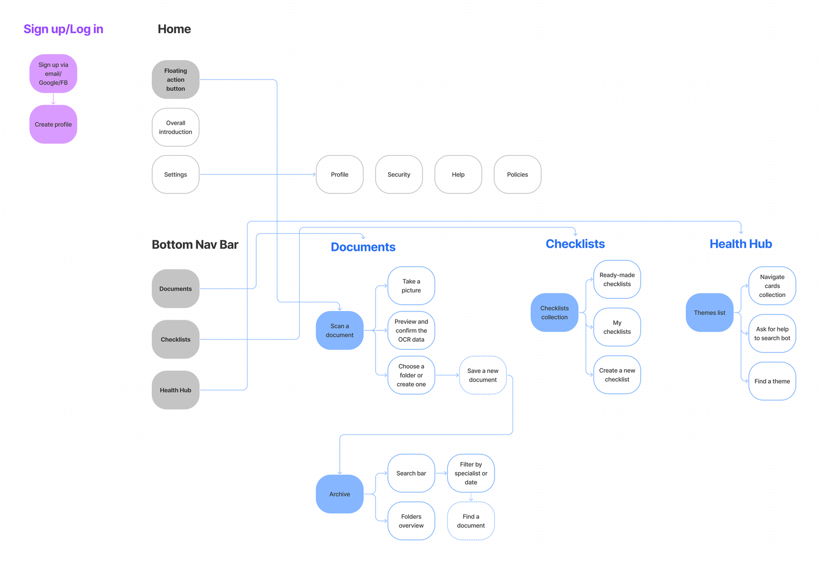
Wireframes
Based on the information architecture, I created three paper wireframe versions of the app’s home screen and highlighted some features and elements to design a final version of this main screen. Later, I started to design the digital wireframes of the project.

Low-fidelity Prototype
After finishing the digital wireframes, I moved on to generating the low-fi prototype focused on a user flow, the task of this flow is to find a ready-to-use checklist for the cataract extraction procedure.
💡Note: to interact with and see the prototype on a larger scale, you can click the “full screen” button in the upper right corner, which appears while you hover.
Usability Studies
Next, I formulated a UX research plan to carry out the user testing. I wanted to learn how easy it was for users to find the ready-made checklists, so they can verify their important requirements before and after surgeries or medical appointments. Based on a list of prompts, I conducted a Moderated Usability Study which sessions lasted from 15 to 20 minutes, after the task completion the research participants filled a System Usability Scale form.
🚶🏽♀️Participants: 5 – two males and three females – frequent patients of medical services between 27 and 65
🎯Research goal: Determine the elements of the ready-made checklists that are difficult to use or unappealing
Usability Testing Findings
To analyze the data collected in the user tests, I applied the affinity mapping method, which allowed me to generate three main themes.


Theme 1: People like to be guided step-by-step through their journey with clear and straight messages.
2 out of 5 participants felt confused or didn’t realize when they actually landed on the checklist screen and it was ready to use.
“I prefer to be guided by clear messages and buttons more than browsing. I think it would be easier with more communication” — Participant 1, Eye patient
Theme 2: People try to find target information by selecting the tool they see at first glance on the screen.
3 out of 5 participants tried to find the target information with the first option they saw. Most participants would like to have a quick and easy tool for finding information centrally located on the screen.
“I am the type of person that selects the first option that my eyes see, and as the filter option was in the middle of the screen I chose that path and wouldn’t notice that there are other options to find what I am looking for, for instance scrolling down” — Participant 3, Eye patient
Theme 3: People need clear clues to understand the possibilities offered by the application.
2 out of 5 participants said they did not understand the potential use of the app when they first saw the home screen.
“I would say it is about…I don’t know…It could be several things, it seems like something where you write an email or something” — Participant 5, Eye patient
Research insights
✅ Well-defined step-by-step guides
Users need better cues, such as short, to-the-point messages that guide them to their target checklist.
🔎 First-glance accessible search tools
Users need options for searching and filtering information that save them time and effort and is centrally located.
💎 Onboarding to uncover the app’s value
Users need a first introduction to the app to comprehend its possibilities and features.
Design decisions examples
Insight P0: Clear guides step-by-step
Decision: to improve the written cues of interaction and navigation elements such as buttons to guide the users through the checklist selection process.
Insight P1: first-glance accessible search tools
Decision: to improve the labels of the search field and filter tool that are located in the center of the screen.

Refining the design
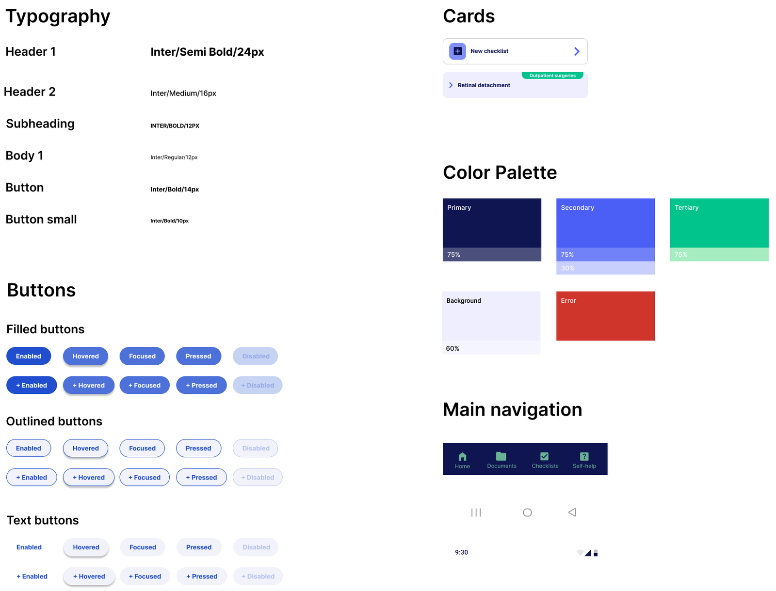
Design Kit
To start the high-fidelity prototyping design stage, I put together a design kit with the main elements of the graphical system for Vision App. I created this kit using Material Design. One of my purposes when doing this, was to make my work more suitable for collaboration with development.
Final Solution
This product aims to improve the customer experience of patients before and after receiving medical attention in the Eye Hospital, by allowing them to manage their medical documentation, control medical instructions, and help themselves to solve doubts from anywhere.

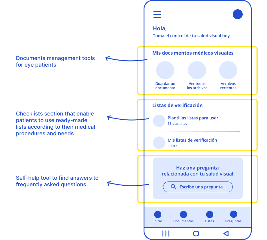
Home screen
Vision’s home screen shows users the main sections of the app.
Here, they can visualize and access the document and checklists management tools and ask questions related to their visual health with the self-help search tool.
Multiple possibilities
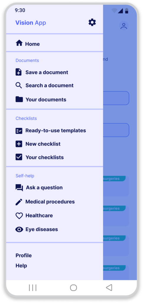
In the navigation drawer, users have access to different destinations in the app.
This modal drawer allows the users to visualize the tools of the three main app sections in a list view.

Checklists screen
On the checklists main screen, users find access to the three main tools in this category: create a new checklist, access the full list of ready-to-use checklists, and access their own checklists.

Ready-to-use checklists
In this section, users have the ability to explore the entire collection of checklists.
These checklists are tagged according to procedure type, and users can search for the desired list with keywords or filter by procedure.
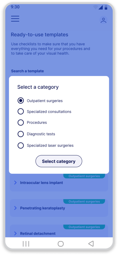
Category selection
With the category filter, users can easily find their target checklist by procedure category, namely, outpatient surgery, specialty consultation, medical procedure, diagnostic testing, or specialty laser surgery.

Taking the control
Finally, when users access the checklist of their interest, they can check and verify the different requirements and instructions to stay on top of essential requirements before and after their visual medical procedures.
High-Fidelity Prototype
Finally, I generated a high-fidelity prototype focused in one user flow, the flow’s task is to find a ready-to-use checklist for the cataract extraction procedure.
💡Note: to interact with and see the prototype on a larger scale, you can click the “full screen” button in the upper right corner, which appears while you hover.
Going forward
Next steps
To keep working on this project I would continue as follows:
- Second round of user testing using the high fidelity prototype.
- Implementation of changes and improvements based on insights.
What I learned
Throughout this project, I was able to learn about the different stages of the user-centered design process. I learned that every process is different and that the methods and tools we use to address problems and work on solutions can vary and be adjusted to the context.
Finally, I learned that a problem can be addressed in multiple ways, and that the most important is to promote paths that make sense to people.